Spring Break Rewind
Design - Josh Smith/Nate Rocco | Art Direction - Nick Devine | Animation - Derek Kunze
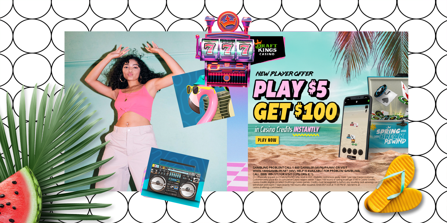
DraftKings Casino aimed to launch a visually striking campaign to promote its exclusive gaming experiences with a fresh, nostalgic twist. The "Spring Break Rewind" campaign transported players to a retro vacation vibe, combining vibrant aesthetics with engaging promotional offers to attract new users and re-engage existing ones.
CHALLENGE: The goal was to design a campaign that stood out in the crowded online casino market and appealed to many people. The challenge was to create a unified design that mixed modern gaming with nostalgic elements, reflecting the spirit of a fun throwback spring break.
APPROACH: The creative direction embraced a bold, retro-futuristic aesthetic inspired by 80s and 90s pop culture.
Typography & Color Palette: Neon pinks, teals, and yellows combined with chunky, playful typography to evoke a sense of excitement and nostalgia.
Throwback-Style Graphics: Geometric patterns, zigzags, and confetti-like elements added a playful and dynamic energy.
Visuals: A beachside casino setting was created, featuring a neon-lit slot machine, palm trees, and iconic throwback objects like boomboxes, flamingos, and retro sunglasses.
Branded Elements: Consistently incorporating the DraftKings crown and brand colors ensured seamless brand recognition across different assets.
RESULTS: Increased User Engagement: The eye-catching graphics led to higher-than-average engagement rates on social media and ad platforms.
CONCLUSION: The "Spring Break Rewind" campaign successfully combined nostalgia-driven visuals with a compelling promotional offer, creating an engaging and memorable experience for players. By leveraging bold design elements and strategic branding, the campaign not only attracted attention but also delivered measurable business results for DraftKings Casino.